Renovation Physical
Therapy Branding
Therapy Branding
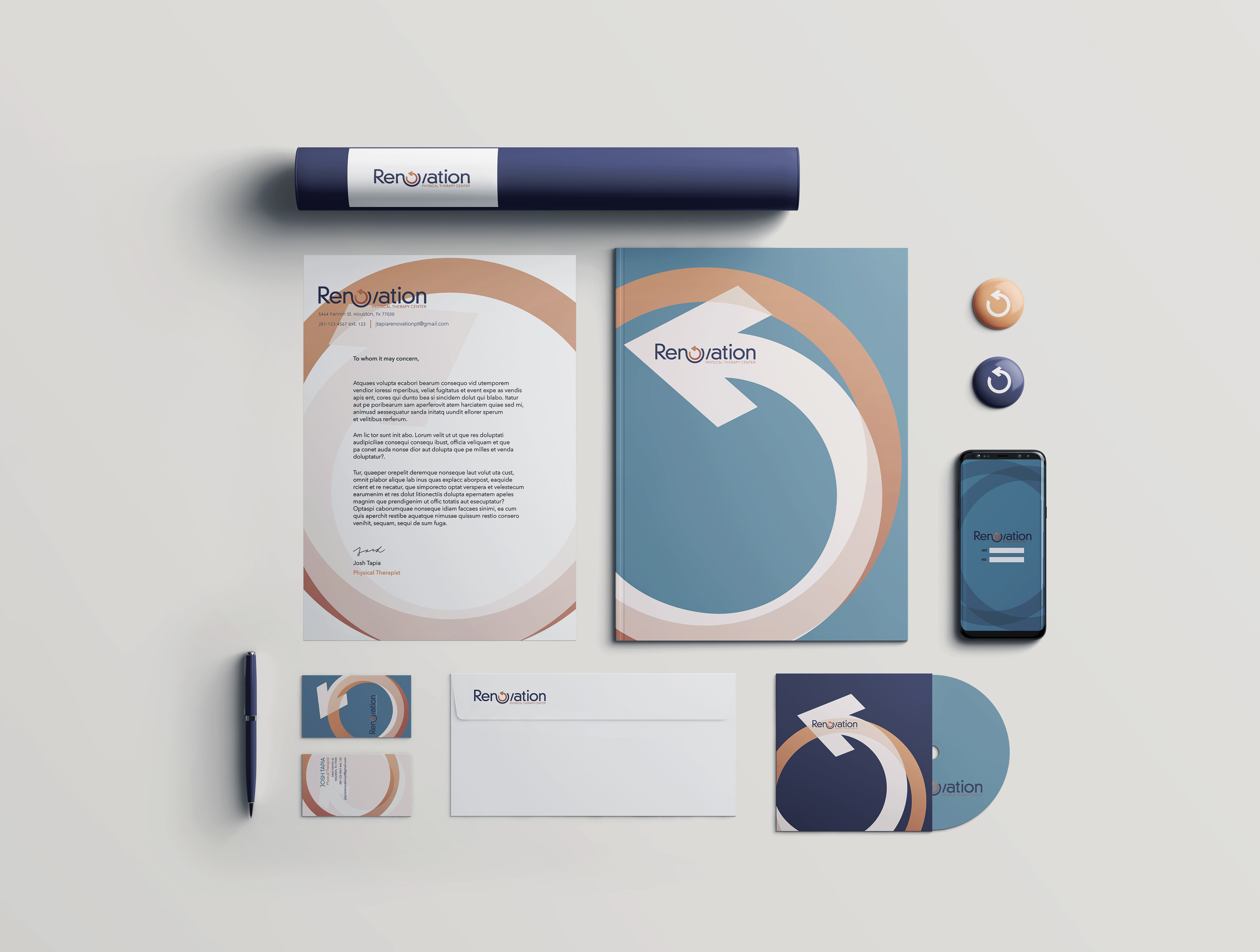
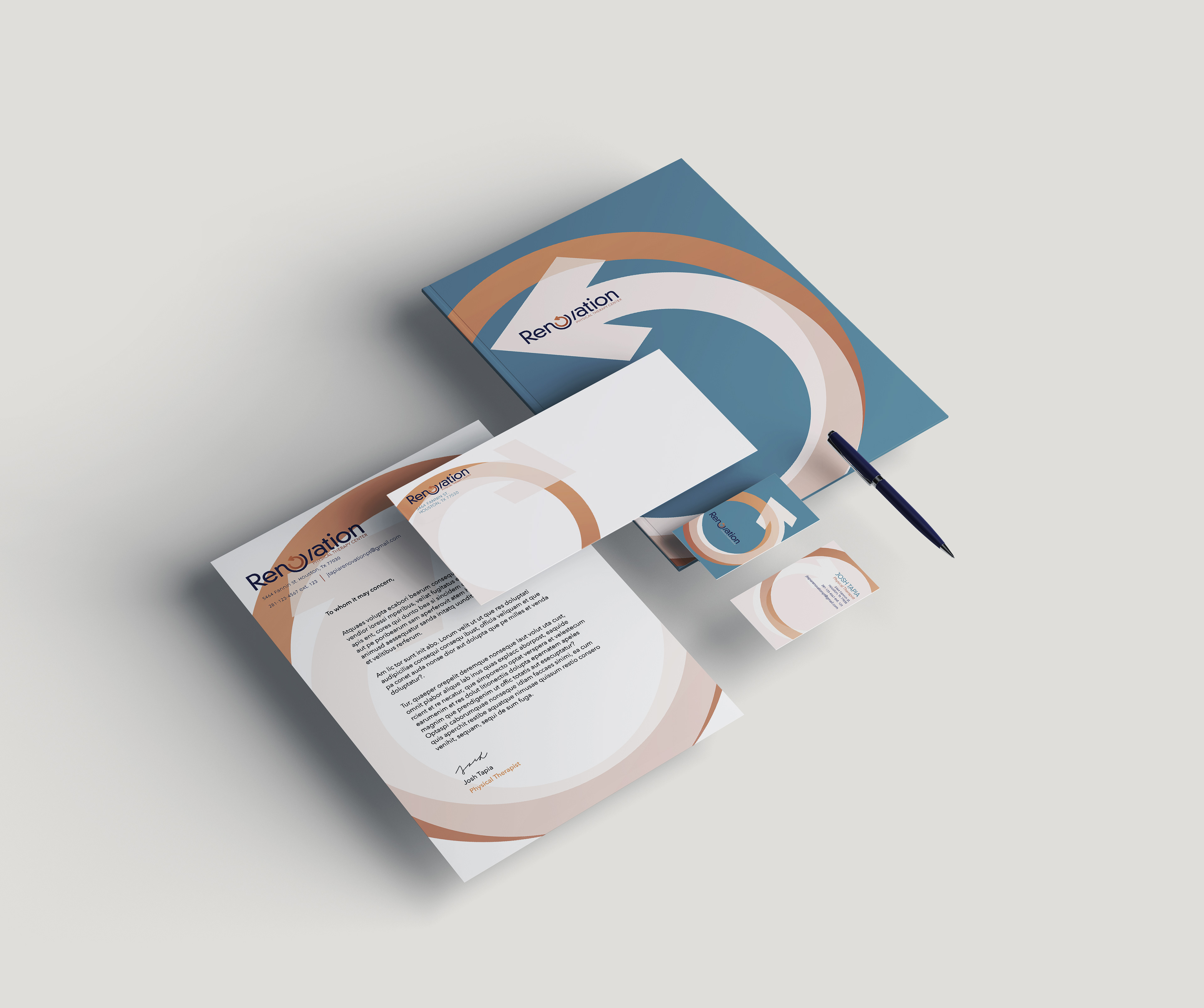
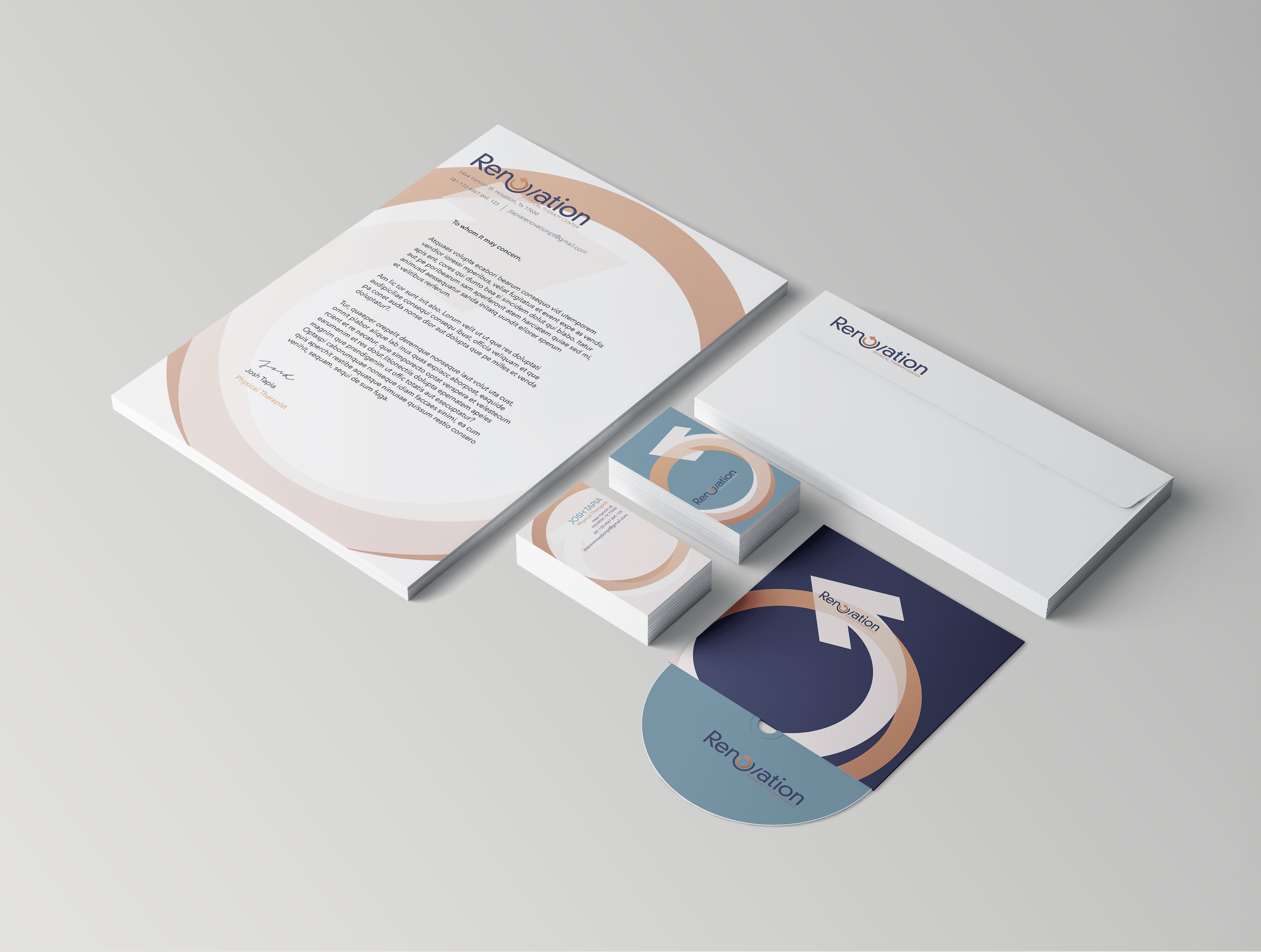
Renovation Physical Therapy Center is a fictitious therapy center. The idea behind this project is to create a medical brand and identity.
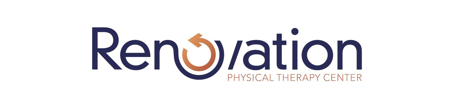
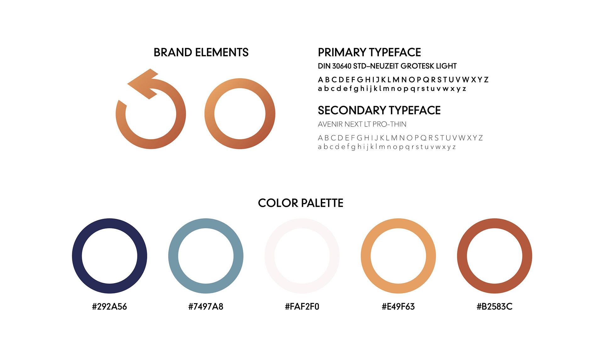
The goal of physical therapy is to restore, to go back to prime condition and function. With that in mind, as I was brainstorming ideas for the logo, I thought of the redo icon. Like the goal of physical therapy, the function of the redo icon is to go back to the original state. Once I knew I wanted to use it, the dilemma was on how to use it. After much experiment, I included it with the type as the replacement of the first letter O.
The Logo