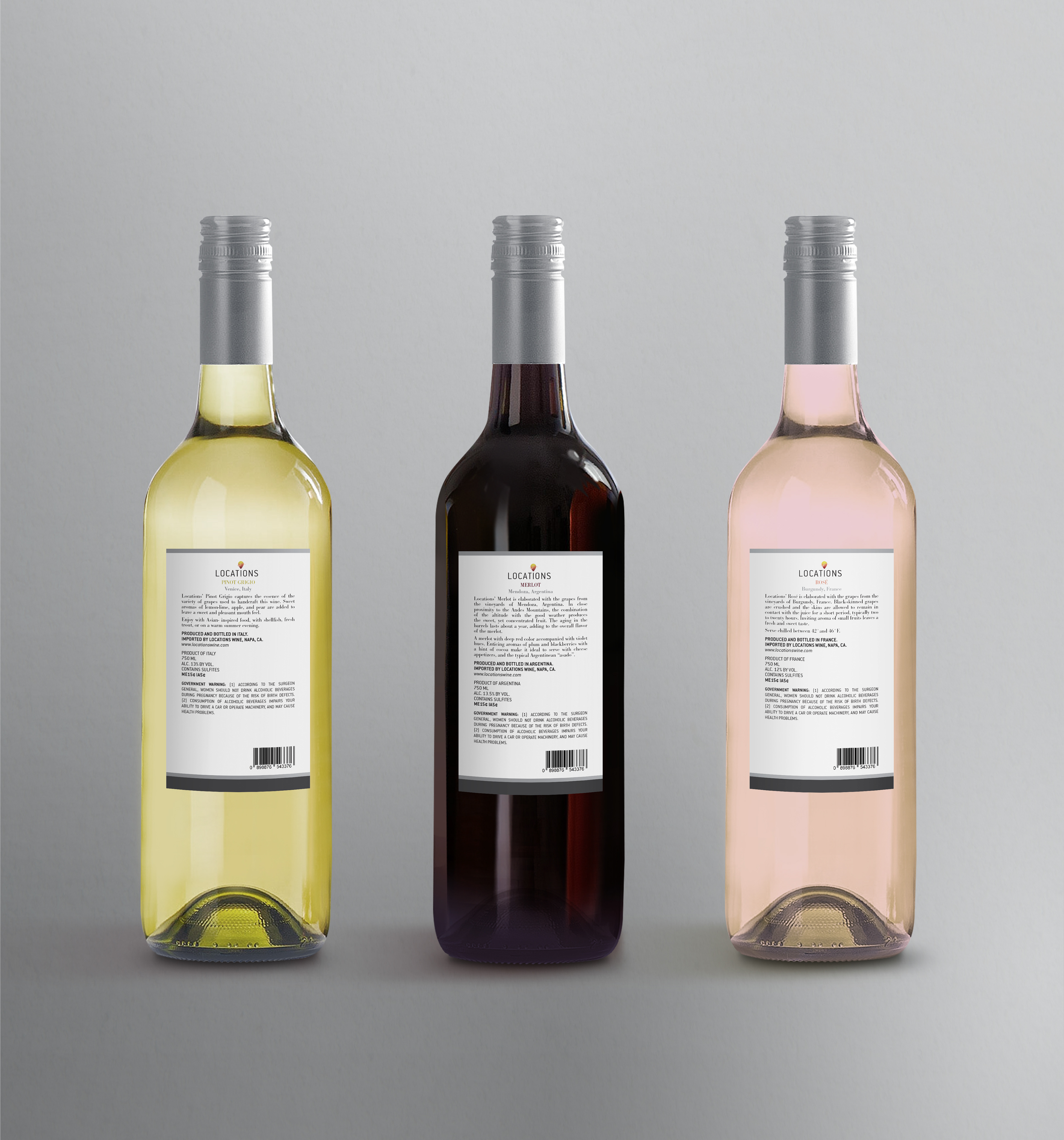
Locations Wine rePackaging
Locations Wine is a brand that imports wine from all over the world. It's a unique idea in that it gives consumers an opportunity to taste wines from all over the world. Below is the redesign of their logo and packaging.
the logo & icon
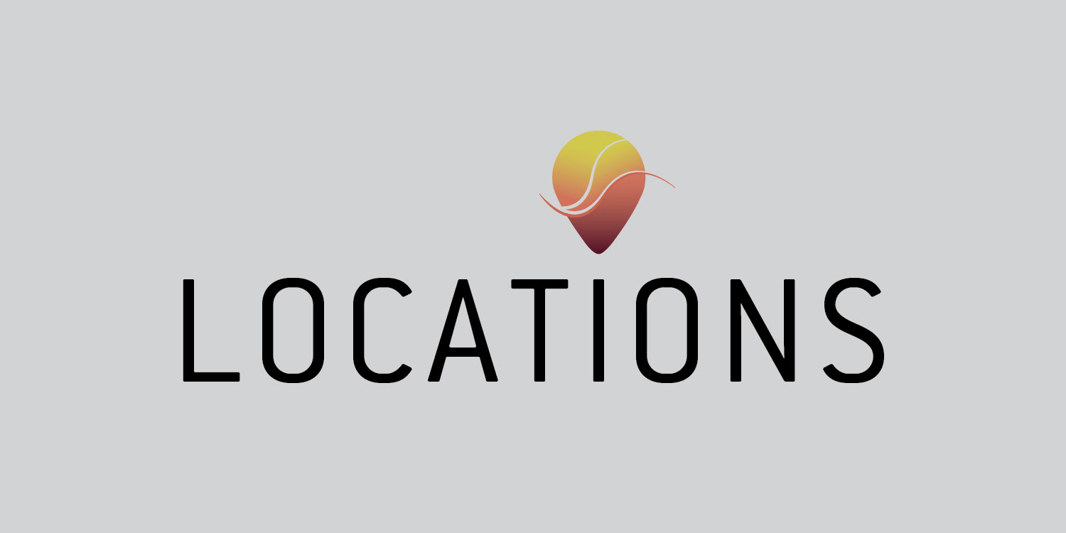
For the logo, I wanted the typography to be reinforced by an icon that could also be used alone if desired. As I thought about what the word location embarked, I decided to incorporate the location icon into the logo. A gradient using the colors found in three of the most popular wines fills the icon. Those colors include burgundy for Merlot, the pink for Rosé and the yellow-green for Pinot Grigio. To emphasize the movement of the liquid, I added two curved lines within the logo, with one coming out of the logo.


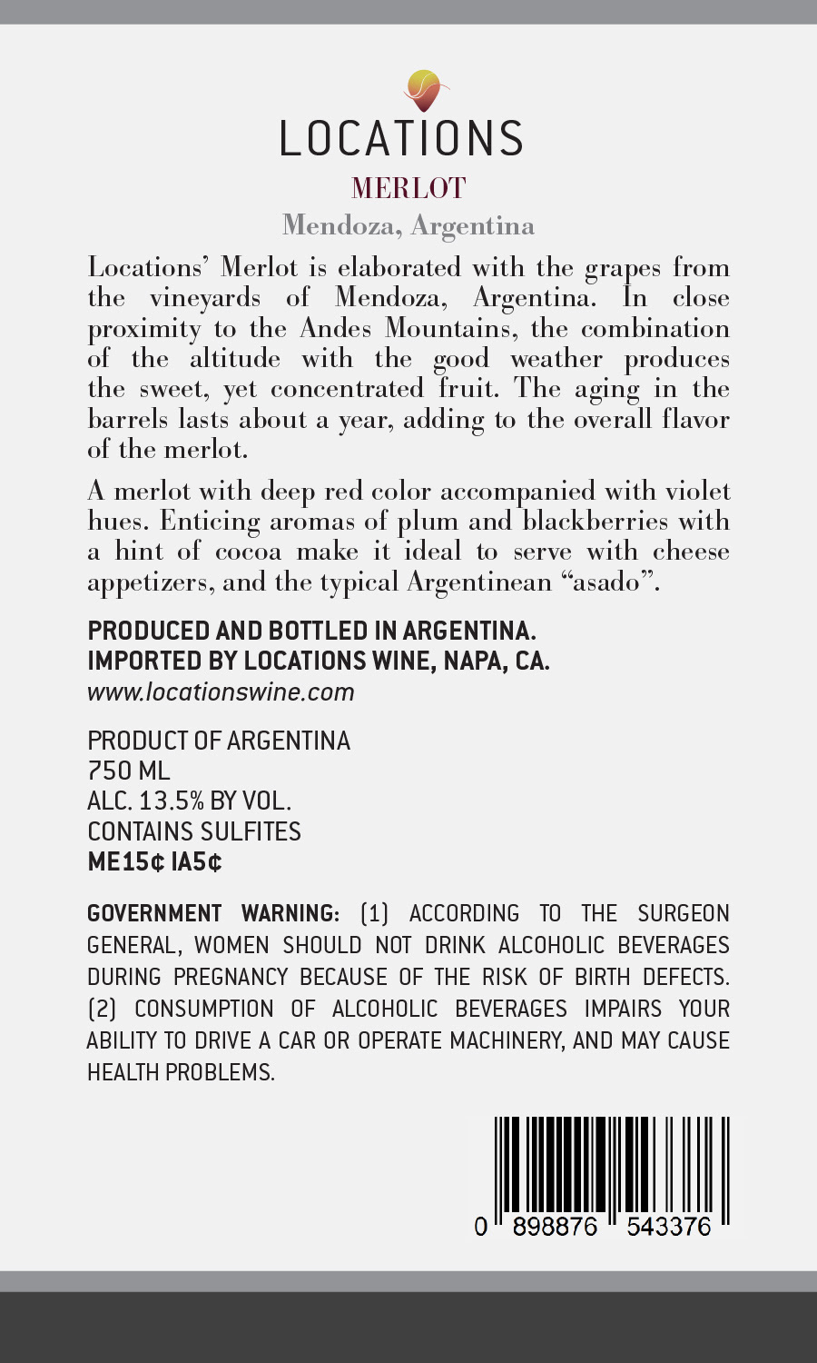
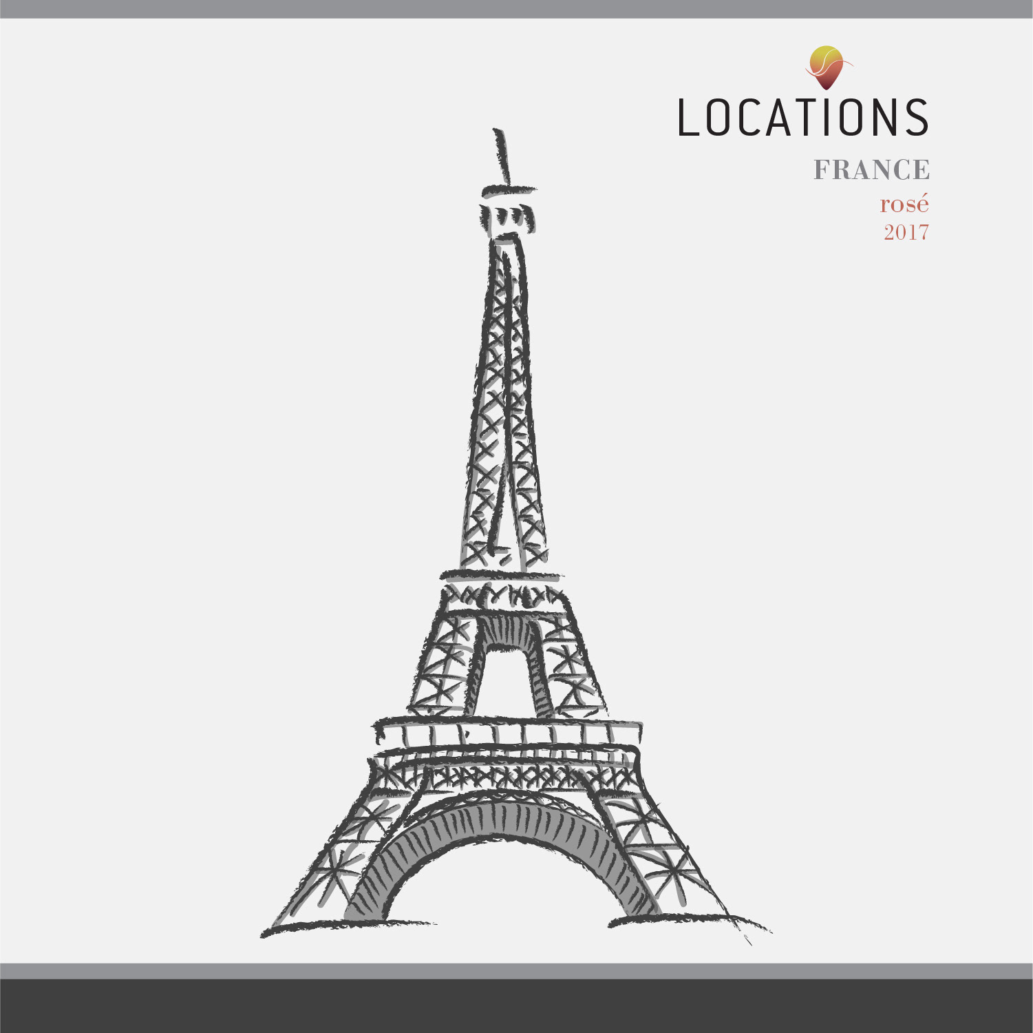
packaging
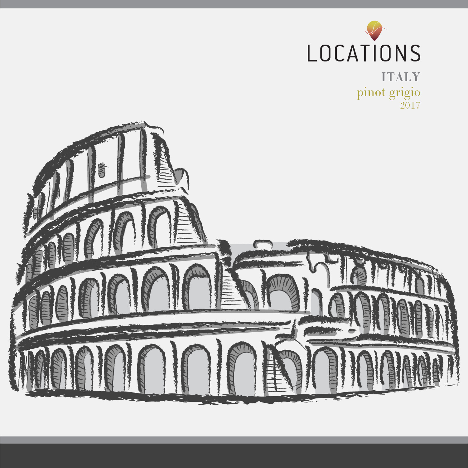
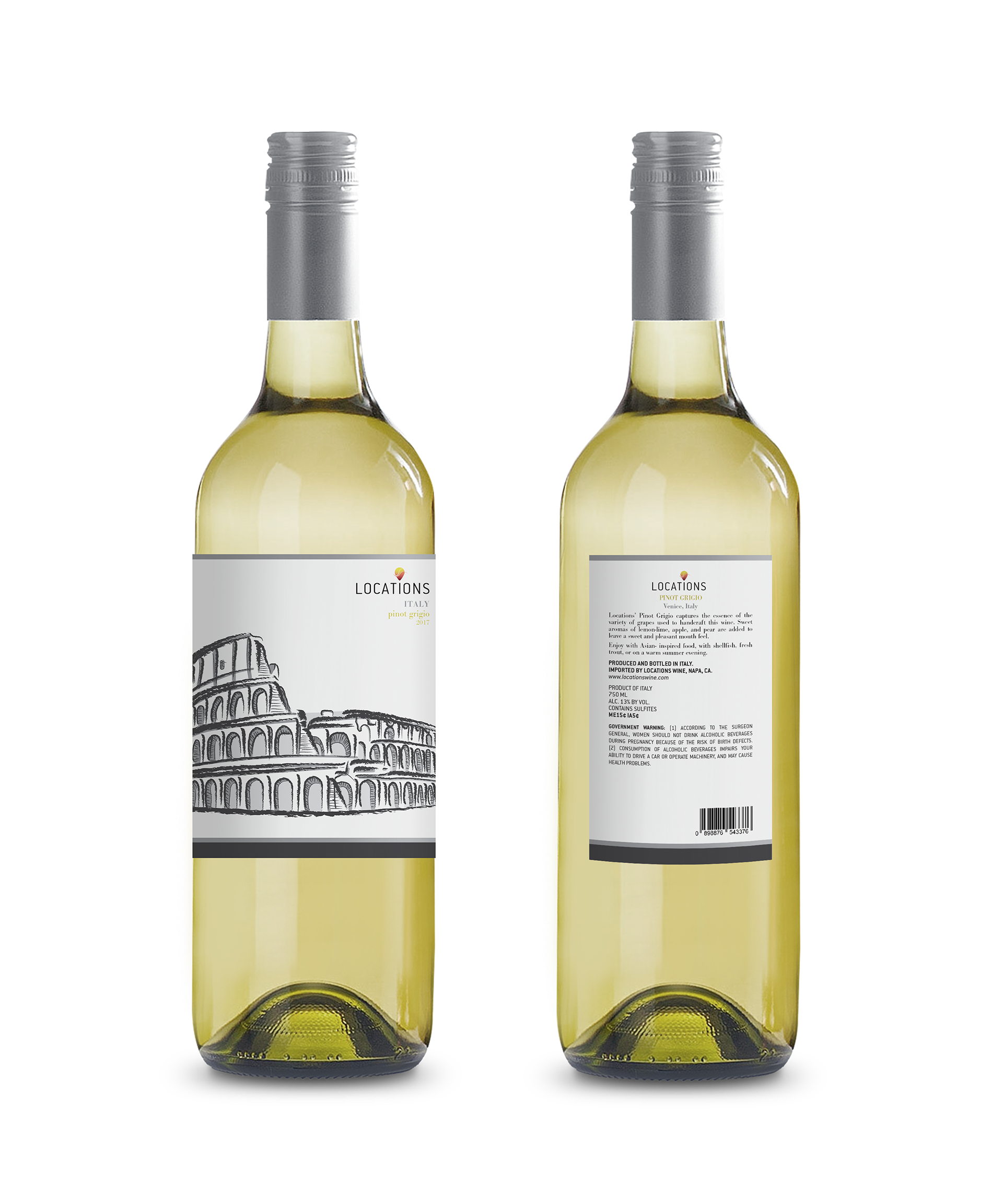
For the labels in the front, I illustrated one of the most recognized landmarks found in each respective country.
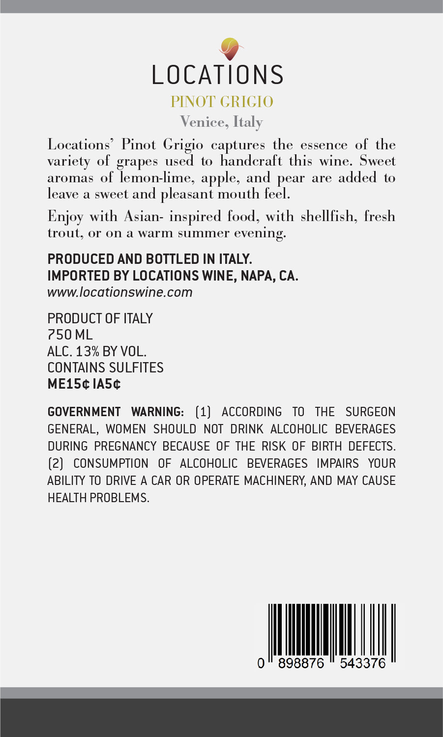
I also designed the back label, but kept it simple to best display the information the consumer needs to know about each wine.

Merlot


Rosé


Pinot Grigio